
Links

Links (also known as hyperlinks) are words, phrases, or images that users can select. Links let users jump to a new web page or site, move to another section on the current page, or open a document.

Links help direct people where to go and should be selectable by mouse, touch, and keyboard-only operations.

Text Links

Text links are made up of text characters.

Choose meaningful words.

The words should clearly convey where you are taking the user if they select the link.

Example: Click here, Learn more, Read more, Link, A

These are not meaningful words and do not provide any information on where a person might land if they select the link.

Better Example: Learn how to apply to Illinois State University

These words better communicate what the user can expect if they select the link.

Be concise.

The link text should be just long enough to convey the purpose or target of the link. Avoid using long and complicated URLs with a jumble of numbers and letters.

Example: View Illinois State's accessibility course at https://reggienet.illinoisstate.edu/portal/site/c66955a1-9dd5-4c84-a2c4-c609a27b62c6.

The hyperlink is messy and the URL is unnecessary to show. It's also too long. A better and more concise way to get people to view the accessibility course would be to link the meaningful text. In this case, it's the call to action.

Better Example: View Illinois State's accessibility course

This lets people know where they are going and eliminates the messy, long URL.

Short URLs like www.IllinoisState.edu and email addresses like rreggie@ilstu.edu are okay to use.

Example: Head to IllinoisState.edu to learn more about Reggie Redbird.

See also: Accessibility: Links

Opening Links in a New Window or Tab

We follow the established usability best practice of allowing people to choose their path when opening links. This means that all links, even those to external websites, should open in the same tab or window. This lets people choose on their own whether they want the link to open in a new tab or window.

Button Links

Button links will generally have "call to action" text within a rectangle or box-like element. Buttons often ask users to do something, like submit a form.

Buttons can also trigger new content to appear.

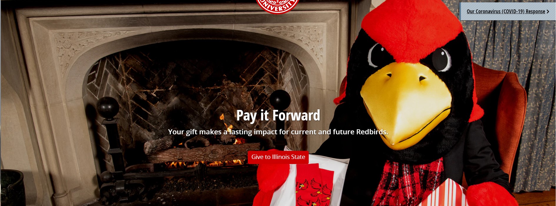
Example: Call to Action button on Hero Space

cds-call-to-action-button-exampleSee also: Buttons

Image Links

We do not recommend using images as links. If an image has a use case to be used as a link, the image must be given alternative text that represents the function of that link. The alt text should not describe the image, but instead, treat the image as a text link.

Example use cases:

  • Department Logo
  • Social media icons
  • Search button icon
  • Central Login Button
  • My logo in the iGuide

There are deprecated instances that exist in our web system where images are used as links. We are moving away from using images in this manner.

Heading Links

Heading links are heading text which is also used as a link. We do not recommend using headings as links unless it is unavoidable. In some cases, linking a heading can help avoid having redundant or generic links like "Read More." At times, heading links can also serve as navigation to subpages.

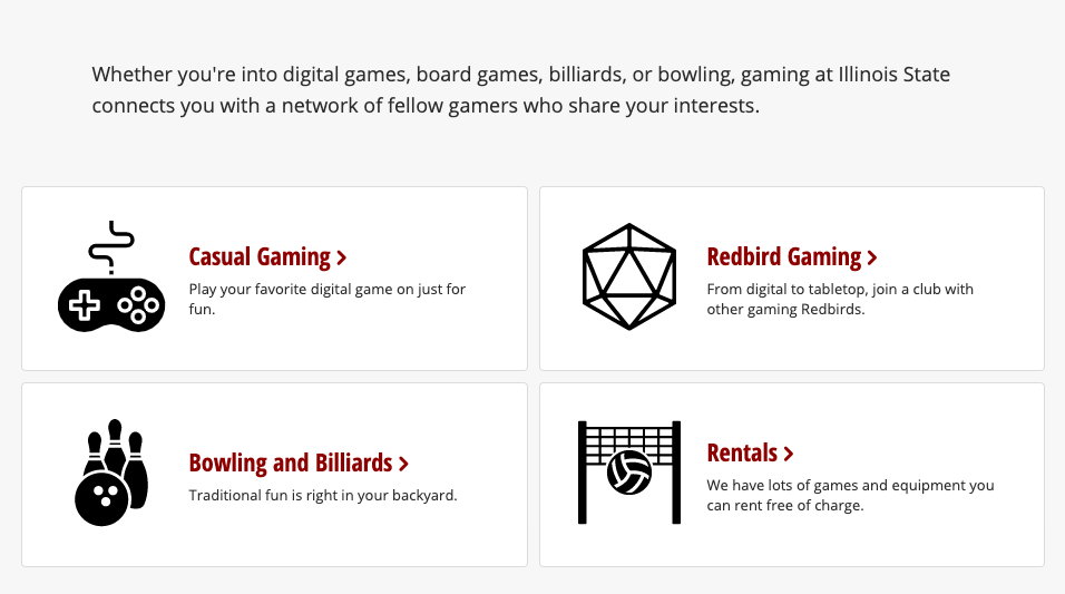
Example: Cards with heading link

cds-cards-with-heading-links-example