Snippet Library
Common Snippets
These snippets are elements that will be used inside sections. You can combine them to create different styles and designs. Considered them stand-alone blocks that can help us to better display content.
Section Layout Snippets
This list's snippets can be considered pre-built sections with all the classes, divs, and initial editable regions the user needs to build a full-width section layout. These snippets' structure is different from the common snippets, and here, you can find a quick explanation of its structure.
V4 Vocabulary
Here is a list of terms you will see a lot in the V4 environment, and you need to understand.
-
Auto
This term indicates that the number of grid or list items that will appear on a single line is automatically determined based on the size of the screen. You would choose an "auto-" grid or list when you want the screen size (or "viewport") to determine the max number of minimally-sized items that will fit next to each other on a single line, which is typically the case. Smaller screens may only have one or two items per line, while larger screens might fit 3, 4, or 5 using our default gap space (space between items).
While primarily built to "just work", Auto patterns are ultra flexible in the front end. Designers and developers can manipulate the pattern's custom properties to change the min/max size of its items, which will alter the calculation that determines how many items fit on the same line. Utility classes, such as
.u-space-gap-collapsed, will also have an effect on that calculation, making Auto patterns quite customizable. -
Fixed
This term refers to a grid or list that has a predetermined (maximum) number of items per line. The
--one-up,--two-up,--three-up,--four-up, and--five-upkeywords are used to indicate what that number should be. You would choose a "fixed-" grid or list when you want to limit the number of items shown on a single line, which is often a strategic content design decision. On smaller screens, Fixed patterns are built like Auto patterns — the number of items is determined by the size of the viewport. However, once the screen is wide enough to accommodate the maximum number of minimimally-sized items indicated, e.g.class="o-fixed-grid o-fixed-grid--two-up", the Fixed patterns will only show that number of items per line, regardless of how many items are in the grid.Fixed patterns don't offer the same level of flexibility as Auto patterns. In particular, the calculations used to determine when the screen can accommodate N-items is hard-coded into the CSS along with the default gap space. Customization is theoretically possible, but may produce unexpected results.
-
OUX
OUX patterns are built to provide ultimate editability within a WYSIWYG editor. The OUX in the V4 environment means that the element that holds a series of other HTML tags is the one that handles the CSS styling of all the inside tags. We can use the Card element to explain how the OUX works to make it more straightforward. Inside a card element, we can have a title, a paragraph, image, buttons, anchor links, or a list. If these elements are inside of an OUX Card, the Card by itself already has all the CSS rules for these elements.
The OUX snippet is also a powerful snippet for the end-user. If they want to add another Card inside a list of cards, they can do it by pressing the 'Enter' key on the keyboard, and another one will be added in the Editor view on the Omni CMS. Although the new Card element will have no element inside of it, the user can add any content on it and, because it's an OUX card, there is no need to add classes to these new elements.
In an OUX snippet, the editable region is applied to an entire list, not to every single element inside of it. Because of this setup, we can make it easier to add new elements using the CMS editor page instead of using the source page.
All the OUX snippets were created to be used on Omni CMS. The OUX snippets can be used as the default snippet options.
Understanding Page Options
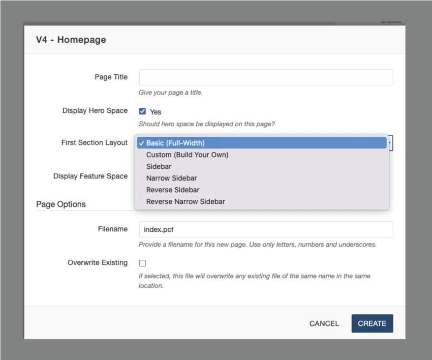
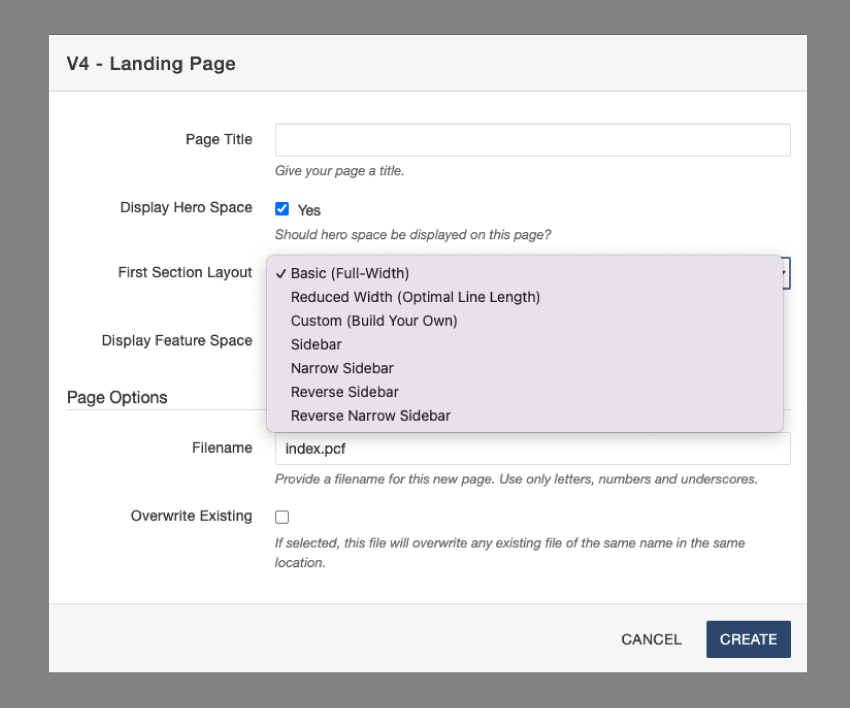
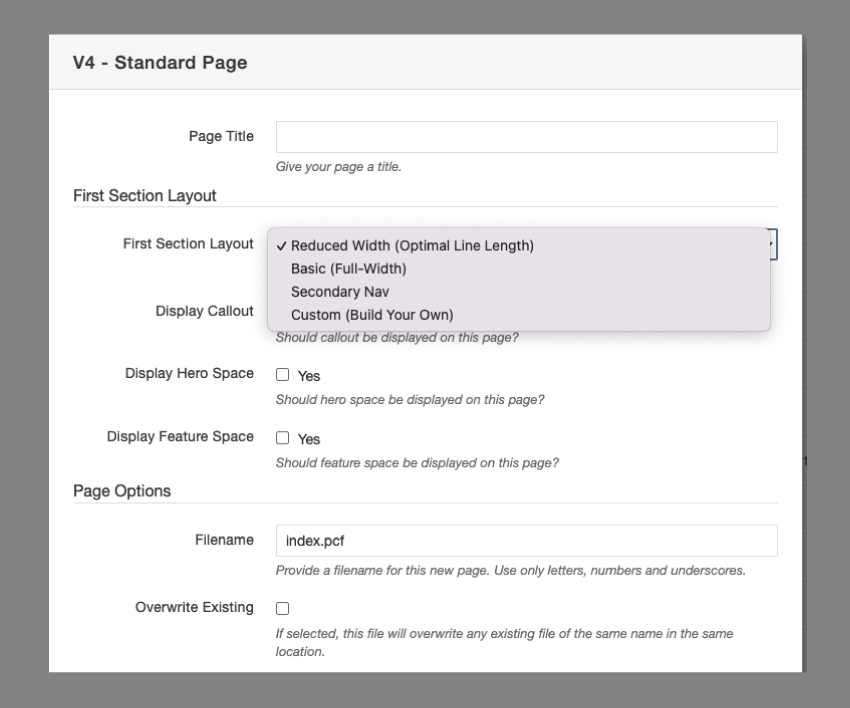
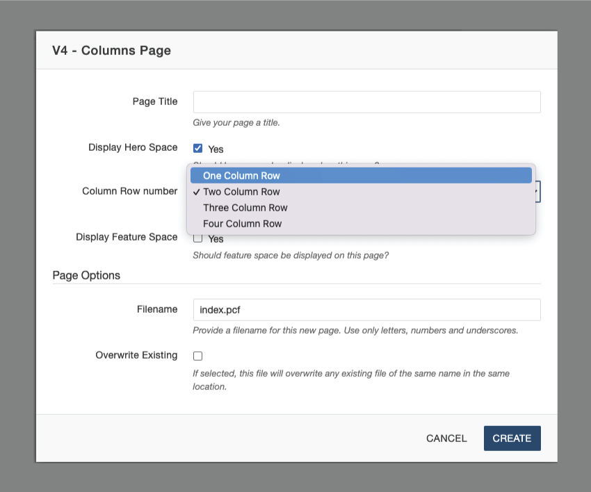
Once we start to build a new page, we can choose different layout styles for the first section of the page during the page creation step. The list of layout styles is different for the types of pages available, as we can see on the images below:
-
Homepage options
-
Landing page options
-
Standard Page options
-
Column Page options
Home and Landing pages
As we can see, we have more options for the layout of the first section for the Home and Landing pages. To better understand the options, here is a brief description of each one:
- Basic (Full-Width): the content will be displayed as one main content through the entire page width;
- Reduced Width (Optimal Line Length) - Landing page only: Reduced width sections have a max-width of 1200px instead of the standard 1600px. This layout is ideal for text content as it creates an optimal line length for reading large sections of text. Care should be taken when using both full-width and reduced-width sections on a page;
- Custom (Build Your Own): this is the option you will choose if you want to use a snippet from the Sections V4 snippet list to help you build the first section of the page.
- Sidebar: the content will be divided into one main content and one sidebar content. There are four different sidebars options, and you can choose the one that most fits your needs. One example of using a sidebar in a section is having quick links on a sidebar.
Standard pages
The layout option in the Standard page type is more limited than the Home and Landing pages because the Standard page is meant to be used as mainly text pages. The first section of this page has the following options:
- Reduced Width (Optimal Line Length) - Default option
- Basic (Full-Width)
- Secondary Nav
- Custom (Build Your Own):
There is also an option of turning visible a Callout card on the first section layout. If we want to add more to this first section than just regular text, we can do it by inserting snippets into the page’s source code. If we want more sections on a Standard page, we can use a snippet from the Sections V4 snippets category.